The gallery is a new type of control that is similar to a menu or a list view, but allows the user to see the preview of the actions associated with gallery items. For example, you can implement a gallery in such a way that, if the user selects a thumbnail in a gallery, a larger and more detailed image will be loaded displayed in the view area (see Figure 1).
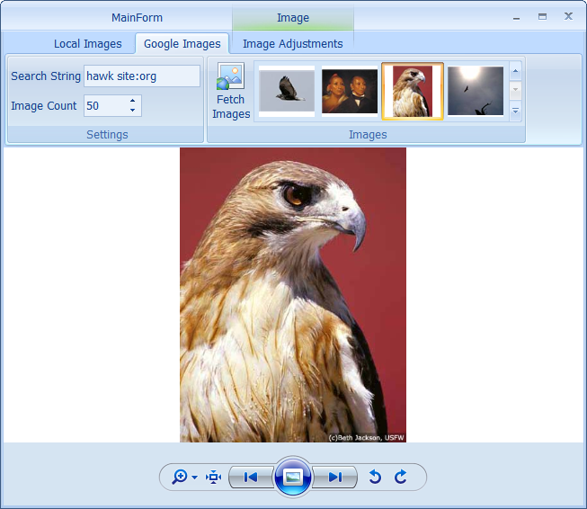
Figure 1 Selected thumbnail in a gallery and its corresponding large image in the view area
In most cases, only a fraction of gallery items are visible (see Figure 2) so, to access the other items, the user should either scroll the whole content using the gallery's up and down arrows or click the bottom-right button to display the gallery pop-up window (see Figure 3).
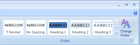
Figure 2 In-ribbon gallery
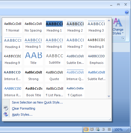
Figure 3 Gallery pop-up window
The separation of gallery items into categories allows the user to easily locate appropriate items (see Figure 4).
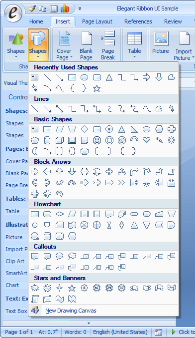
Figure 4 Gategorized gallery items
Gallery filters make it even easier to locate and select gallery items especially if it is a great number of them (see Figure 5).
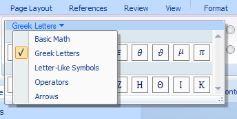
Figure 5 Gallery filters
In certain cases, it may be the best way to put a gallery into a pop-up menu (see Figure 6).
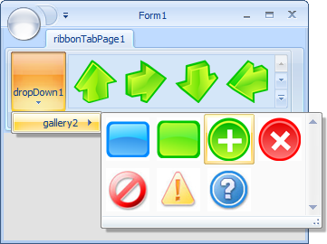
Figure 6 Gallery in a pop-up menu