The button control provides all the features of the regular push button. It also offers the following features:
- Can be used on the ribbon, on the form and in pop-up menus.
- KeyTip support.
- ScreenTip support.
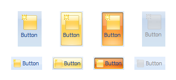
- Separate images for the normal, hovered, pressed and disabled states. In most cases, however, you can simply assign two images (small and large) for the normal state and the state effects will be applied on the fly (see figure below).
- Custom text and image alignment for buttons on the form.
You can see below how a button may look in the ribbon depending on the application size and the current state of the button.

The normal, hovered, pressed and disabled states of the button when it is small and large