Overview
The Elegant Date/Time Picker control (DateTimePicker) enables you to select a date and a time and to display the date and time
with a specified standard or custom format. It consists of the following elements: date and time fields, up and down buttons, calendar
drop-down button and calendar popup (see Figure 1).
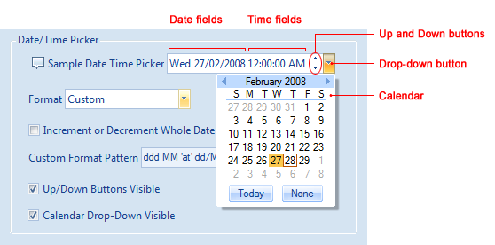
Figure 1 Date/Time Picker control and its elements
The control allows you to set a date and a time using both the keyboard and the mouse.
Configuring Basic Settings
Grab a DateTimePicker control in the Toolbox and drag-and-drop it to your form. Make the desired size and location changes. You can
now change its properties in the Properties window.
Date/Time Formats
The property you will certainly want to modify is Format, which specifies in which format the date and/time is displayed in the control.
It allows you to select one of four system-defined date/time formats (ShortDate, LongDate, ShortTime and LongTime)
or a custom format (Custom) (see Figure 2). When Format is set to Custom, the visual representation
of the date and time is controlled by the CustomFormatPattern string property. For example, if you specify
ddd MM dd/MM/yyyy 'at' hh:mm:ss tt for this property, the date and time will be displayed as
Mon 18 02 2008 at 10:50:23 AM. You can read more about the supported format strings below.
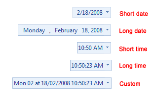
Figure 2 Supported date/time formats
Incrementing/Decrementing Behavior
By default, when the user increments or decrements a date/time field by clicking the up or down button, only the value of this field changes.
For example, when the number in the Minutes field exceeds 59, it becomes equal to 0 and
the Hours field does not change. You can alter this behavior by setting the IncrementOrDecrementWholeDate property to true.
As a result, the date/time fields will become dependent and Hours will be incremented by one.
Visibility of Built-In Buttons
You can show or hide the Up and Down buttons using the UpDownButtonsVisible property. A similar property, CalendarDropDownVisible,
allows you to show or hide the drop-down button, which, when clicked, displays a calendar associated with the date/time picker.
Current Date and Time
The current date/time value is stored in the Value property. This property is of the DateTime? nullable type with the null
value being used when no date is specified, for example when the user clicks the None button in the calendar. You can track changes
of the Value property by handling the DateTimePicker.ValueChanged event.
Calendar Popup
You can show or hide the calendar programmatically by using the CalendarPopupVisible property. The instance of the calendar itself
is available through the Calendar read-only property. This enables you to customize its appearance and behavior.
You can learn more about the calendar control from Using a Calendar Control.
Custom Format Syntax
The format syntax is the same as in the System.Windows.Forms.DatePickerPicker. Below is the description of the format syntax taken from MSDN.
To display string literals that contain date and time separators or to format strings, you must use escape characters in the substring.
For example, to display the date as "June 15 at 12:00 PM", set the CustomFormat property to "MMMM dd 'at' t:mm tt". If the "at"
substring is not enclosed by escape characters, the result is "June 15 aP 12:00PM" because the "t" character is read as the one-letter A.M./P.M.
format string (see the format string table below).
The format strings can be combined to format the date and time. For example, to display the date and time as 06/15/2001 12:00 PM, this
property should be set to "MM'/'dd'/'yyyy hh':'mm tt". For more information, see
Date and Time Format Strings.
The following table lists all the valid format strings and their descriptions.
| Format string | Description | | d | The one- or two-digit day. | | dd | The two-digit day. Single-digit day values are preceded by a 0. | | ddd | The three-character day-of-week abbreviation. | | dddd | The full day-of-week name. | | h | The one- or two-digit hour in 12-hour format. | | hh | The two-digit hour in 12-hour format. Single digit values are preceded by a 0. | | H | The one- or two-digit hour in 24-hour format. | | HH | The two-digit hour in 24-hour format. Single digit values are preceded by a 0. | | m | The one- or two-digit minute. | | mm | The two-digit minute. Single digit values are preceded by a 0. | | M | The one- or two-digit month number. | | MM | The two-digit month number. Single digit values are preceded by a 0. | | MMM | The three-character month abbreviation. | | MMMM | The full month name. | | s | The one- or two-digit seconds. | | ss | The two-digit seconds. Single digit values are preceded by a 0. | | t | The one-letter A.M./P.M. abbreviation (A.M. is displayed as "A"). | | tt | The two-letter A.M./P.M. abbreviation (A.M. is displayed as "AM"). | | y | The one-digit year (2001 is displayed as "1"). | | yy | The last two digits of the year (2001 is displayed as "01"). | | yyyy | The full year (2001 is displayed as "2001"). |
|