Overview of Galleries
The gallery is a new type of control introduced in Office 2007. It is similar to a menu or a list view, but allows the end-user to see the preview of the actions associated with gallery items. For example, you can implement a gallery in such a way that, if the user selects a thumbnail in a gallery, a larger and more detailed image will be loaded displayed in the view area (see Figure 1).
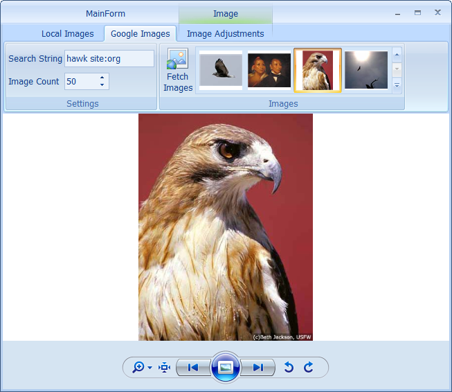
Figure 1 Thumbnail image in a gallery and its corresponding large image
You can use galleries not only in ribbon groups but also in pop-up menus (see Figure 2).
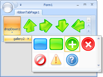
Figure 2 Gallery in a pop-up menu
Elegant Ribbon meets all the requirements for galleries outlined in 2007 Microsoft Office System User Interface Design Guidelines.
Populating a Gallery
You can populate a gallery either with bound items or with unbound items.
Galleries, as any other bound Windows Forms controls, support the DataSource and DataMember properties, which allow you connect a gallery to a data source. So in this case, each gallery item is represented by a data source item.
When a gallery is bound to a data source, its Gallery.Items collection is read-only.
Here is an example of how you can populate a gallery with bound items.
[C#]
gallery1.DataSource = dataSet11.Customers;
gallery1.ItemImagePropertyName = "CustomerPhoto";

[VB.NET]
gallery1.DataSource = dataSet11.Customers
gallery1.ItemImagePropertyName = "CustomerPhoto"
If you do not need complex data binding, you can simply populate the Gallery.Items collection with GalleryItem objects or with objects of any other type. In the latter case, you can provide the gallery control with additional information about the custom class that represents gallery items by setting the following properties:
- ItemImagePropertyName
- ItemTooltipTextPropertyName
- ItemCategoryNamePropertyName
For instance, you have a class called Employee with a property Photo that keeps the employee's picture. You should specify Photo in the gallery's ItemImagePropertyName property so that the gallery can display employees images without any additional effort from your side.
The following example illustrates how you can populate a gallery with items programmatically.
[C#]
Image image1;
Image image2;
Image image3;

GalleryItem galleryItem = new GalleryItem();
galleryItem.Image = image1;
gallery1.Items.Add(galleryItem);

galleryItem = new GalleryItem();
galleryItem.Image = image2;
gallery1.Items.Add(galleryItem);

galleryItem = new GalleryItem();
galleryItem.Image = image3;
gallery1.Items.Add(galleryItem);

[VB.NET]
Dim image1 As Image
Dim image2 As Image
Dim image3 As Image

Dim galleryItem As GalleryItem = New GalleryItem()
galleryItem.Image = image1
gallery1.Items.Add(galleryItem)

galleryItem = New GalleryItem()
galleryItem.Image = image2
gallery1.Items.Add(galleryItem)

galleryItem = New GalleryItem()
galleryItem.Image = image3
gallery1.Items.Add(galleryItem)
Displaying Items
There is a Gallery.ItemDrawMode property that allows you to specify in which way gallery items should be displayed or painted. In the Gallery.ItemDrawMode, you can set one of the following three modes listed in the GalleryItemDrawMode enumeration:
- CenterImage (Default)
- OwnerDrawWithStandardBackground
- OwnerDraw
By default, Gallery.ItemDrawMode is set to CenterImage. In this mode, the image associated with each gallery item is displayed in the content rectangle with the image aspect ratio preserved (see Figure 3). You can increase or decrease the size of content rectangle using the Gallery.ItemContentPadding property.
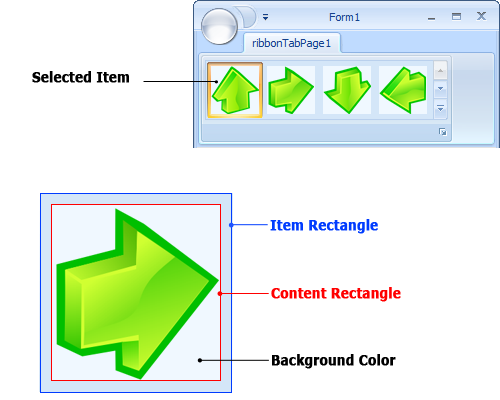
Figure 3 Gallery item
Besides, before drawing an image, the content rectangle is filled with a color specified in the Gallery.ItemContentBackgroundColor property. You can disable this by setting Gallery.ItemContentBackgroundColor to Color.Transparent (see Figure 4).
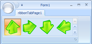
Figure 4 Gallery items with a transparent background
So, in most cases, you only need to populate a gallery with gallery items and assign an appropriate image to each item. The background and foreground effects for item states (normal, hovered, pressed and selected) are provided by Elegant Ribbon itself.
However, there may be cases, when it is not enough to display only static images for gallery items and you would like to get full control over image drawing. The two modes, OwnerDrawWithStandardBackground and OwnerDraw, allow you to achieve this so you can handle the Gallery.DrawItem event and draw gallery items yourself. The difference between these modes is that when OwnerDrawWithStandardBackground is on, you do not need to draw the background and foreground effects for item states but rather focus on drawing gallery items. In the case of OwnerDraw, the framework draws nothing so you should implement all drawing yourself.
The following code snippet illustrates how to display gallery items when Gallery.ItemDrawMode is set to OwnerDraw.
[C#]
void gallery1_DrawItem(object sender, GalleryDrawItemEventArgs e)
{
   e.Graphics.FillEllipse(SystemBrushes.ActiveBorder, e.ContentBounds);
}

[VB.NET]
Private Sub gallery1_DrawItem(ByVal sender As Object, ByVal e As GalleryDrawItemEventArgs)
   e.Graphics.FillEllipse(SystemBrushes.ActiveBorder, e.ContentBounds)
End Sub
Item Measurement
In Elegant Ribbon, all items in a particular gallery have the same size. You can set the width and height of gallery items using the Gallery.ItemWidth and Gallery.ItemHeight properties. Please note that, when a gallery is hosted within a ribbon group (in-ribbon gallery), you can set one of four predefined modes for height (the GalleryItemHeightMeasurementMode enumeration) (see Figure 5 and Figure 6):
- Small (1/3 of in-ribbon height)
- Medium (1/2 of in-ribbon gallery height)
- Large (full in-ribbon gallery height)
- Custom (any height)
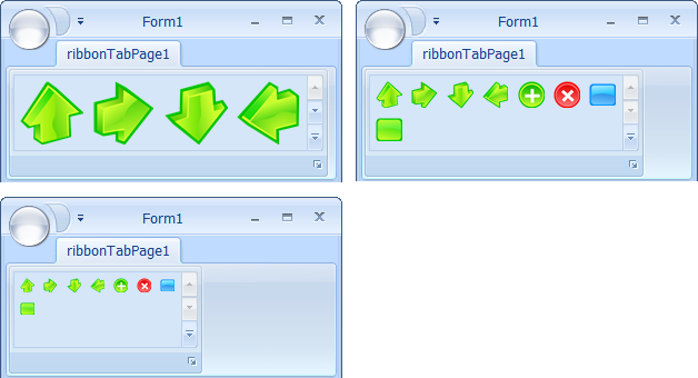
Figure 5 Large, medium and small gallery items in a ribbon group
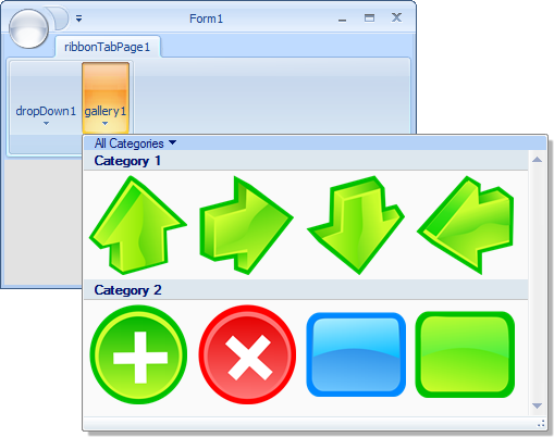
Figure 6 Gallery items of a custom size
The Custom mode is well consistent with a ribbon group that is always collapsed.
You can set a predefined height either in the Windows Forms Designer (the GalleryItemHeightMeasurementMode property) or programmatically (Ribbon.SetGalleryItemHeightMeasurementMode() and Ribbon.GetGalleryItemHeightMeasurementMode()).
Interaction Modes
The end-user can interact with gallery items in two ways. The first is when the user clicks an item, the item becomes selected. If some other item was selected, then it becomes unselected. There can be only one selected item in a gallery and this is what makes gallery items different from toggle buttons in this context. The second way of interaction is similar to that in pop-up menus, which is when the user clicks an item, only some action is performed as a result of the click but the item itself does not remain selected. You can select the way of interaction for a particular gallery by using the Gallery.InteractionMode property, which can take two values, Selection and Action.
If the gallery is in the Selection mode, you can determine which gallery item is currently selected by using the Gallery.SelectedItem property. When the selected item has changed, you can perform any needed actions by handling the Gallery.SelectedItemChanged event.
If the gallery is in the Action mode, you can handle the Gallery.ItemClick event.
Instead of handling Gallery.SelectedItemChanged or Gallery.ItemClick events, you may want to assign a command to the gallery (read more about commands in Using Commands) and deal with the command object. In the Selection mode, when the selected item has changed, the command data changes. In the Action mode, when the item is clicked, the command is executed. The clicked item is passed as the command execution argument.
Item Categories
When there are a lot of items in a gallery and especially when the items can be divided into separate logical units, you may want to group them into categories so that the end-user can easily locate appropriate items. For example, you can see how the gallery controls in (see Figure 7) can be split into two categories.
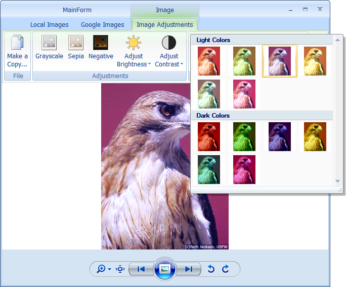
Figure 7 Two categories in a gallery pop-up window
Gallery items cannot be categorized when the gallery is hosted in a ribbon group.
In Elegant Ribbon there is a collection of categories, ItemCategories. Each item is represented by the GalleryItemCategory class and has two properties, Name and Caption. The Name property is used for identifying galleries so you cannot change it on the fly.
You can categorize gallery items in a particular gallery in two simple steps:
- Add the desired number of categories to the Gallery.ItemCategories collection. For each category specify its name (the Name property) and caption text (the Caption property) (see Figure 8).
- Associate gallery items with categories by specifying the category name (the CategoryName property) for each gallery item (see Figure 9).
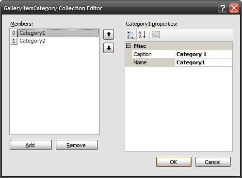
Figure 8 Gallery category properties
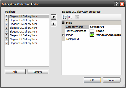
Figure 9 Associating a gallery item with a category
The following code illustrates how to categorize gallery items programmatically.
[C#]
gallery1.ItemCategories.Add(new GalleryItemCategory("Category 1", "Category 1"));
gallery1.ItemCategories.Add(new GalleryItemCategory("Category 2", "Category 2"));

Image image1;
Image image2;
Image image3;

GalleryItem galleryItem = new GalleryItem();
galleryItem.Image = image1;
galleryItem.CategoryName = "Category 1";
gallery1.Items.Add(galleryItem);

galleryItem = new GalleryItem();
galleryItem.Image = image2;
galleryItem.CategoryName = "Category 1";
gallery1.Items.Add(galleryItem);

galleryItem = new GalleryItem();
galleryItem.Image = image3;
galleryItem.CategoryName = "Category 2";
gallery1.Items.Add(galleryItem);

[VB.NET]
gallery1.ItemCategories.Add(New GalleryItemCategory("Category 1", "Category 1"))
gallery1.ItemCategories.Add(New GalleryItemCategory("Category 2", "Category 2"))

Dim image1 As Image
Dim image2 As Image
Dim image3 As Image

Dim galleryItem As GalleryItem = New GalleryItem()
galleryItem.Image = image1
galleryItem.CategoryName = "Category 1"
gallery1.Items.Add(galleryItem)

galleryItem = New GalleryItem()
galleryItem.Image = image2
galleryItem.CategoryName = "Category 1"
gallery1.Items.Add(galleryItem)

galleryItem = New GalleryItem()
galleryItem.Image = image3
galleryItem.CategoryName = "Category 2"
gallery1.Items.Add(galleryItem)
Category Filters
If you have gallery items divided into categories, you may want to allow the users to filter out categories so that they can see gallery items belonging to one or more categories (see Figure 10).
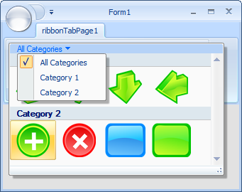
Figure 10 Category filters
To enable this feature, set the Gallery.CategoryFilterEnabled property to true.
You can control category filters by modifying the Gallery.CategoryFilterItems collection. Each item in this collection is an object of the GalleryCategoryFilterItem class and it represents a filter item in the drop-down menu. The filter item has two properties: GalleryCategoryFilterItem.Name and GalleryCategoryFilterItem.CategoryNames. The first stores a string that represents the filter item in the drop-down menu and the second is a collection of strings that specify which categories will be displayed when the filter is selected.
You can find out which filter is applied at the moment by using the Gallery.SelectedCategoryFilterItem property.
Below is a code snippet that demonstrates how to implement category filtering.
[C#]
gallery1.ItemCategories.Add(new GalleryItemCategory("Category 1", "Category 1"));
gallery1.ItemCategories.Add(new GalleryItemCategory("Category 2", "Category 2"));

gallery1.ItemCategoryFilterEnabled = true;
gallery1.ItemCategoryFilters.Add(new GalleryItemCategoryFilter("All", new string[]
         { "Category 1", "Category 2" }));
gallery1.ItemCategoryFilters.Add(new GalleryItemCategoryFilter("Category 1", new string[]
         { "Category 1" }));
gallery1.ItemCategoryFilters.Add(new GalleryItemCategoryFilter("Category 2", new string[]
         {"Category 2"}));

[VB.NET]
gallery1.ItemCategories.Add(New GalleryItemCategory("Category 1", "Category 1"))
gallery1.ItemCategories.Add(New GalleryItemCategory("Category 2", "Category 2"))

gallery1.ItemCategoryFilterEnabled = True
gallery1.ItemCategoryFilters.Add(New GalleryItemCategoryFilter("All", New String() _
         { "Category 1", "Category 2" }))
gallery1.ItemCategoryFilters.Add(New GalleryItemCategoryFilter("Category 1", New String()
         { "Category 1" }))
gallery1.ItemCategoryFilters.Add(New GalleryItemCategoryFilter("Category 2", New String()
         {"Category 2"}))
Gallery's Menu
A gallery supports a menu at the bottom. You can populate this menu in the Windows Forms Designer (see Figure 11) or programmatically. In the latter case, the Gallery.Popup property returns an instance of the regular pop-up menu (PopupMenu). So you can use its PopupMenu.Items property to populate or modify the collection of menu items.
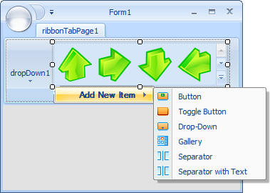
Figure 11 Adding items to the gallery's menu at design time
Gallery Pop-Up Window
When a gallery in a ribbon group is expanded or a gallery in a pop-up menu is clicked, gallery items are displayed in a gallery pop-up. The end-user can resize the gallery pop-up with the resizing gripper (see Figure 12). You can specify in which way this pop-up window should be resized by using the Gallery.GalleryPopupResizeMode property. There are three resizing mode available (the GalleryPopupResizeMode enumeration): NoResize, ResizeVertically and ResizeVerticallyAndHorizontally. The latter is used by default.
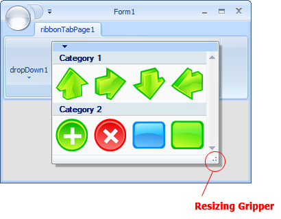
Figure 12 Gallery pop-up window with the resizing gripper
Tooltips
You can set tooltip text for any gallery item. If a gallery item is represented by the GalleryItem class, you just need to specify the desired tooltip text in the TooltipText propertry. If it is an instance of some other type, this type should implement the Gallery.ItemTooltipTextPropertyName property, which you should use for setting the tooltip text (read Populating a Gallery).
|