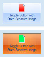
The toggle button allows the user to toggle between two states of an object. It also offers the following features:
- Can be used on the ribbon, on the form and in pop-up menus.
- KeyTip support.
- ScreenTip support.
- Separate images for the normal, hovered, pressed and disabled states. In most cases, however, you can simply assign two images (small and large) for the normal state and the state effects will be applied on the fly.

Figure 1. Toggle buttons in a ribbon group

Figure 2. Normal (unset) and pressed (set) states of the toggle button