Common Controls
How to customize the names of commands in the Customize Quick Access Toolbar dialog?
In the sample applications provided with Elegant Ribbon (e.g. Elegant Ribbon UI) you can find an example of the dialog that allows the user to customize the Customize Quick Access Toolbar. This dialog fires when the user clicks More Commands… in the Quick Access Toolbar menu or Customize Quick Access Toolbar… in the ribbon context menu. Until version 3.2, the command names displayed in the dialog were the names of the corresponding controls, which was not appropriate in some cases because command names are usually terse. Starting from version 3.2, you can customize the displayed names as it is described below.
Open a sample project that contains the Customize Quick Access Toolbar dialog (e.g. Ribbon UI Sample). The ribbon in the sample contains a button with the default name Paste. Compile and run the sample. Open the Customize Quick Access Toolbar dialog and find the Paste command. Now you can change its name to Custom name for the Paste command by using the following code.
[C#]

// 1) Create a class that overrides GetControlTextLabel()
// of QuickAccessToolbarControlsEditorForm

public class MyQATCustomizationDialog : QuickAccessToolbarControlsEditorForm
{
   public MyQATCustomizationDialog(Ribbon r) : base(r)
   {
   }

   protected override string GetControlTextLabel(IControl control)
   {
      if (control.Command == ApplicationCommands.Paste)
         return "Custom name for the Paste command";

      return base.GetControlTextLabel(control);
   }
}

// 2) Instantiate and use your class instead of the standard dialog

private void ribbon1_CustomizeQuickAccessToolbar(object sender,
      QuickAccessToolbarCustomizeEventArgs e)
{
   MyQATCustomizationDialog d = new MyQATCustomizationDialog(ribbon1);
   d.ShowDialog();
   e.Handled = true;
}

[VB.NET]

' 1) Create a class that overrides GetControlTextLabel()
' of QuickAccessToolbarControlsEditorForm

Public Class MyQATCustomizationDialog
   Inherits QuickAccessToolbarControlsEditorForm
   Public Sub New(ByVal r As Ribbon)
      MyBase.New(r)
   End Sub

   Protected Overrides Function GetControlTextLabel(ByVal control As IControl) As String
     If control.Command Is ApplicationCommands.Paste Then
       Return "Custom name for the Paste command"
     End If

     Return MyBase.GetControlTextLabel(control)
   End Function
End Class

' 2) Instantiate and use your class instead of the standard dialog

Private Sub ribbon1_CustomizeQuickAccessToolbar(ByVal sender As Object, _
      ByVal e As QuickAccessToolbarCustomizeEventArgs)
   Dim d As MyQATCustomizationDialog = New MyQATCustomizationDialog(ribbon1)
   d.ShowDialog()
   e.Handled = True
End Sub}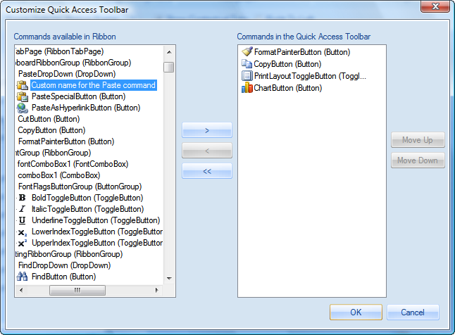
I added a control to a ribbon group, compiled and started the application. Why the Add to Quick Access Toolbar item in the context menu for this control is disabled?
Make sure you assigned a command to this control. Only controls with assigned commands can be added to the Quick Access Toolbar. You can read more about this in Using Commands. How to fill the background of a control with a color?
By default, most controls in Elegant Ribbon are painted using a themed background so the BackColor property is ignored. You can change this behavior by setting the UseVisualThemeForBackground property to false. In the same way, the control's text will be drawn using the color set in ForeColor if you set the UseVisualThemeForForeground property to false. How to implement two vertically distributed controls in a ribbon group?
Sometimes it may be handy to have two controls distributed vertically (see screenshot) instead of the default layout with three vertically stacked controls. You can follow these simple steps to implement this layout: - Set the VerticallyDistributed property to true for both controls.
- Choose a name and set it for the LayoutGroupName property for both controls.
- If the top control is preceded by some other control in the group, set the FlowBreak property of the other control to true.
- If the bottom control is followed by some other control in the group, set the FlowBreak property of the other control to true.
How to set large and small images for a control?
Any common control in Elegant Ribbon has LargeImages and SmallImages properties, which contain large and small images for different states of the control. For example, you can set a small image that will be displayed when the control is hovered by the mouse pointer or when it is disabled. Please note that the number of states can vary by control. You can set the properties both programmatically and in the Visual Studio Windows Forms designer. How to use a text string as a separator in a pop-up menu?
There is a separator control (Separator) in Elegant Ribbon, which, when put into a pop-up menu (PopupMenu), has two informativeness levels (the Informativeness property): Separator and SeparatorWithText. By default, the separator looks like a horizontal line but you can display a text string as a separator instead (see the figure below). 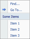 You can achieve this in two simple steps: - Set the Informativeness.FixedLevel property to SeparatorWithText.
- Specify the text itself in the Separator.Text property.
How to align labeled controls horizontally both by labels and by input fields?
The combo box (ComboBox), text box (TextBox) and up-down control (NumericUpDown) have the LabelText property, which allows you to set an icon and text for each of these controls. In many cases it looks good when neighboring controls are aligned both by labels and by input (selection) fields (see the figure below). 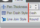 You can produce such a layout in two steps: - Align the controls by their left edges (by labels) as you normally do.
- Determine which control has the longest label string and set the TextBoxBasedControl.LabelAreaWidthTemplate property of all these controls to this string value. For example, it is Pen Dash Style for the controls in the figure above.
If you have any questions, please visit our forum or contact our technical support team at support@prof-uis.com.

|